Saturday, April 4, 2015
Friday, April 4, 2014
Smart Reminder Application

1/ Home page

2/ Function page: there are 4 main functions for this app
- About Us/About me: Intro information about owner (Mission/Vision)
- Profile: more information about owner
- Topic subscription: This function is for users modify the topics they are interested
- Message library: the collections of messages from Owner to users which are classified in different topics

3/ In the first function, message library, there are various topics to choose

4/ After clicking on any of the topic in message library, clients are able to view various news' title about that topic

5/ Upon clicking on the title, users are able to view complete/partial news

6/ Another important function of Smart Reminder is Topic Subscription function
Friday, November 1, 2013
A Dime for A Meal Postcard


“A Dime For A Meal to the little kid. Not much, but everyday”
"A Dime for a Meal" is a Non Profit Project that help underprivileged children in Vietnam
Sunday, October 13, 2013
Travelling website - How to design the home page?

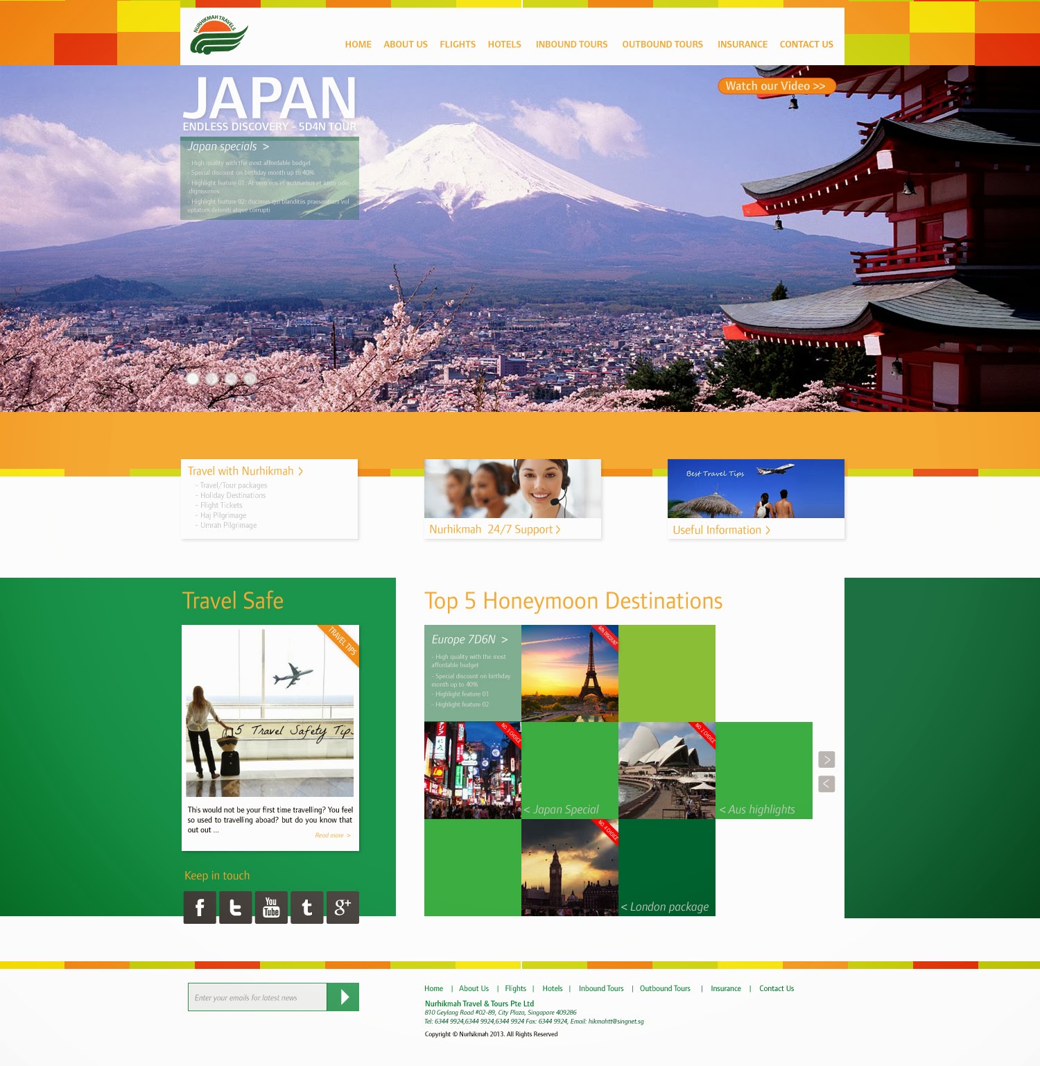
Main function:
1/ Slideshow: comprise many photos, each photo would be an opportunity to promote a feature of Nurhikmah's service. The photo could represent a special tour, special discount or certain outstanding features Nurhikmah want to promote.
- Slide description: by default will appear in short form but will show expended version with more detail while hovering. Upon clicking on this feature, users are directed to respective page.
- Short commercial video: Strongly recommend this feature for client website. With numerous competitors offering similar products, instead of getting customers surfing tediously, a short 1-3 minute video is a great way to describe exactly what the audience needs to know and what Nurhikmah want to offer. This feature will appear on the same position on each slideshow's photo
2/ Menu: Menu is traditionally put on top of slideshow. Personally, I think people get used to the menu that way. I try to avoid putting menu bar on strange place that could confuse users especially from older generations.
3/ Travel, Support, Useful Info: study from current website, I notice these 3 features are among important features and tell much about Nurhikmah's way of business. On hovering, more information will be show on each of the feature and upon clicking will direct user to respective page.
4/ Grid: the grid is a slideshow-like function that including 2 main features, grid01 on the left and grid02 on the right with social media banner under grid01.
Depend on the objectives of Nurhikmah admin teams, content od grid01 and grid02 will be changed respectively. Upon hovering over certain sub-features on the grid, the information is dynamically changed to stimulate good impressions from users.
Incomplete grid shape: personally, I think a complete grid is not as appealing as an incomplete grid but it would depend on client's ideas for the final product.
5/ Footer: including newsletter, address, sitemap. Newsletter is positioned here not to hide but I would suggest upon entering the website, a pop-up would show up and ask whether users want to receive newsletters from Nurhikmah website with lots of benefits (example: deal.com.sg). I think this is far more effective.
Conclusions: Home Page is probably the most important page in a website. The more interactive to engage users, the more features to show offs, the better business client gets. The designs aim to follow instructions with careful consideration/assumption on client's branding objective and their potential customers.
Calender 2014 Draft version 01


Objectives: come up with a professional for Fred Hollows Foundation based on design guideline and description from Viet's first email
Each page include: main photo and 4 to 6 squares.
Main photo: represent each of the 12 messages(photo captions) in the last email.
Text captions (messages) will be added in later. This caption will be purposely "hidden" (by placing it somewhere not very prominent) for the audience to discover. The idea behind is to capture attention from the audience by a good photo and when the audience is curious enough, they will find out the message of the photo.
The squares:
Each square abstractly represent an opportunity to help blind people. There are a photo behind each of the square. The ones in blue showing uncaught opportunities. The squares with photos inside suggesting successful attempts helping people. More squares will be filled with photos in later months of the years' designs (showing working progress).
Friday, September 13, 2013


Subscribe to:
Posts (Atom)